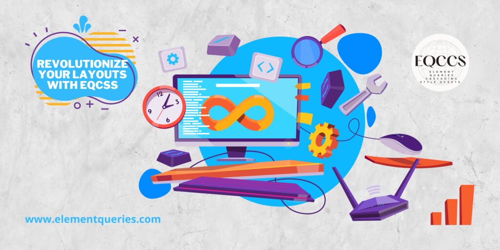
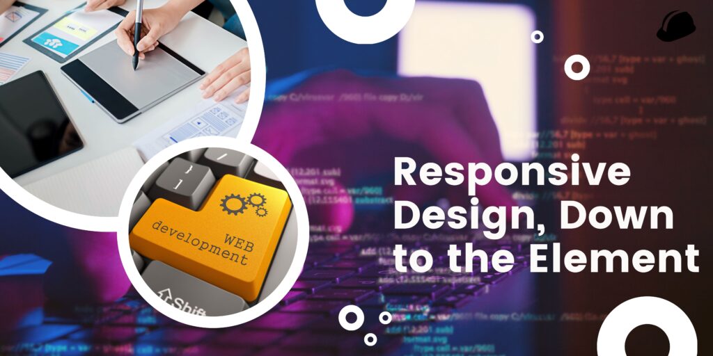
When it comes to creating websites, flexible design is now the gold standard. Now more than ever, it’s crucial that your website’s design and functionality work well regardless of the device being used to view it. However, it is not always easy to create a design that responds to changes in screen size and orientation by adapting the presentation of individual page components. For this reason, EQCSS is employed.
To specify element queries, EQCSS adds a new @element rule to the standard CSS syntax. The rule identifies the sought-after component and the constraints under which the query should be executed. Using EQCSS, you can make your own queries that apply to particular components on the page, letting you modify their styles based on their size, position, or other properties.
EQCSS’s adaptability is a major strength. You can simply incorporate element queries into your current stylesheets and processes because they are defined using CSS. Furthermore, EQCSS can be used in tandem with your existing development tools, as it integrates smoothly with preprocessors and postprocessors used in CSS.
To top it all off, EQCSS is simple to implement. If you’re already familiar with CSS, you’ll find that EQCSS’s grammar is very similar, making it easy to learn. You can use EQCSS’s advanced features, like nesting and variables, to build complex queries that can handle a broad variety of situations.
Your flexible layout can be improved with the help of EQCSS. In addition to media queries, element quaries cascading style sheets (EQCSS) allow you to tailor each element’s presentation to its specific size and context on the screen. The improved user experience that results from this finer level of adaptable design is substantial.
As a result, many web writers now prefer to use EQCSS instead of media queries. Any web designer or coder would benefit greatly from using EQCSS due to the fine-grained control it affords that is impossible with media queries.
However, there are some disadvantages to using EQCSS that should be taken into account. Due to the fact that EQCSS is essentially a collection of CSS add-ons, it necessitates a certain degree of browser support. Inconsistent styling may result if earlier browsers cannot properly interpret EQCSS rules. Many web developers, however, see EQCSS as the future of responsive web design because of the growing support it has in contemporary browsers.
In summation, EQCSS is the tool you need to take your responsive design to the next level. Styles can be modified based on the element’s size, position, or other characteristics via custom queries that can be created. With its adaptability, simplicity, and growing popularity, EQCSS is a must-have for any online designer or developer. If you’re a web developer, whether you’re just beginning out or have been doing this for a while, you should check out EQCSS.
EQCSS’s flexible and dynamic design capabilities are one of its main advantages. Media inquiries force designers to make generalized breakpoints that may only apply to certain parts of a screen or device. With EQCSS, however, designers can set breakpoints that apply only to certain parts of a website. This allows for the development of more nuanced and refined designs that maintain their optimal form and function across all platforms.
EQCSS also has the advantage of being more logical than regular CSS. Unlike other CSS frameworks, EQCSS lets you target individual page components rather than entire classes or IDs. Particularly as the complexity of your website grows, this can make your CSS code more readable and manageable.
It’s easy to alter EQCSS to fit your needs. It allows you to make rules that can be applied to any attribute or value that can be controlled by CSS. This allows you to modify not only the dimensions and placement of elements on the website, but also their appearance in terms of color, font, and other attributes.
In conclusion, EQCSS has excellent compatibility with other web development tools and platforms. In the same way that preprocessors and postprocessors like Sass and PostCSS can be used with CSS, so can EQCSS. This facilitates the smooth incorporation of EQCSS into your preexisting web development process.
Finally, element searches in CSS are now possible with the help of EQCSS. Designers and developers can make their own unique queries to affect the visual appearance of the page’s components based on their height, position, and other attributes. When it comes to web creation, EQCSS is adaptable, modifiable, and cross-platform. Due to the growing variety and complexity of websites, EQCSS will soon be a necessity for any web designer or coder serious about making their work mobile-friendly and interactive.